Hallo alle zusammen,
ich entschuldige mich vorab schon einmal für folgende Odyssee durch meine makabaren Englischkünste. =D
Das ganze soll eine Analyse einer Werbung sein und ist zeitgleich auch eine Englischnote, und da ich hier um jedes bischen kämpfen muss suche ich hilfe hier bei euch!
Ein fettes DANKE schon mal vorab an alle, die sich die Mühe machen sich hier durchzukämpfen. =) Hier die Analyse:
Advertisment Analysis Essay (Überschrift)
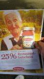
Chosen Ad : "Bertolli"
This full-paged, oilpainting look alike add, for tomato sauce, shows an old italian-looking woman. The woman looks directly into the camera an d she seems to be happy. She is holding (with bothe hands) the sauce really close to the camera, so you can read all details written on the the tag.
The woman stands in a green-looking garden with some trees in the background and some people sitting together on a wood bench - it looks like there where eating something the old lady have coocked. The whole background is a bit fuzzy, so the focus lays on the women : especially at the sauce.
Directly under the jaw, at the middle-bottom at the advertisment you can see a big white box with a huge red font : " 25% restaurante voucher", the red font really catches your eyes and you want to know more about the voucher and how it works. A bit over the red font you can read one olive-green sentence : " Bertolli now with" and the the red font again. This green sentence is smaller than the red one, but also relative big.
Under the big red font you can read the itlian word for hello ("Buongiovno") after that you can read: "Bertolli invites you to an italian."
After this sentence you can see four lines with information and details how the voucher exactly works and the phone-number with the internet address from the company. At the end of this paragraph you can again read something in italian: " Boun appetita!" which means enjoy your meal in english. A little bit under this you can red in a fatter font : "Bertolli.Love the live." At the bottom of the box you can read in an even smaller font some general information about the voucher action.
At the end/bottom of the add you can see the brad of the company.
The add is really looking like it is from italy, exactly in the nature so you associate the saue with a nice warm sommer day in the nature for example a birthday or something like this.
The old woman stands for honestly ; if she is usin it, it can`t be bad. It have to be naturally and good. De facto you can say it`s a product from the nature, no chemistry, no large companys -just a small environmentalist company who don`t want your money who just want to sell there nice product.
For myself i have to say,that this add is really good designed. The company is using the standart AIDA-formula and at me it really worked i would buy it!
So das wars dann =D Wenn euch vom Inhalt her etwas nicht gefällt könnt ihr es gerne verbessern =)
Hier ein Link zu der Werbung : http://www.directupload.net/file/d/4317 ... wu_jpg.htm
Vergrößerbares Vorschaubild: <a href="http://www.directupload.net/file/d/4317 ... wu_jpg.htm" target="_blank"><img src="http://fs5.directupload.net/images/1604 ... 8235wu.jpg" border="1" title="Kostenlos Bilder und Fotos hochladen"></a>
Advertisment analysis essay
-
Alyssea
Re: Advertisment analysis essay
A few simple things to look out for in the future:Amarte hat geschrieben: Advertisment Analysis Essay (Überschrift)
Chosen Ad : "Bertolli"
This full-paged, oil painting look-alike ad for tomato sauce shows an old Italian-looking woman. The woman looks directly into the camera and she seems to be happy. She is holding the sauce (with both hands) really close to the camera, so you can read all of the details written on the the label.
The woman stands in a green garden with trees in the background and some people sitting together on a wood bench--it looks like they are eating something the old lady cooked. The whole background is a bit fuzzy, so the focus stays on the woman, and especially on the sauce.
Directly under her jaw, at the lower edge of the advertisement, you can see a big white box with a huge red font: "25% restaurant voucher". The red font really catches your eye, and makes you want to know more about the voucher and how it works. A bit above the red font, you can read the olive-green sentence "Bertolli now with" and then the red font again. This green sentence is smaller than the red one, but also relatively big.
Under the big red font, you can read the Italian word for hello ("Buongiovno"). After that you can read, "Bertolli invites you to Italy."
After this sentence, you can see four lines with information and details on exactly how the voucher works and the phone number and internet address for the company. At the end of this paragraph, you can again read something in Italian: "Boun appetito!", which means "enjoy your meal" in English. A little bit under this you can read in a bold font, "Bertolli. Love living." At the bottom of the box, you can read, in an even smaller font, some general information about the voucher.
At the very bottom of the ad, you can see the brand name of the company.
The ad really looks like it is from Italy, shown with an Italian background scene, so you associate the sauce with a nice, warm summer day in nature for a party or something like that.
The old woman stands for honesty; if she is using it, it can`t be bad. It has to be natural and good. You can really say it`s a product from nature; there's no chemistry, no large companies--just a small environmentalist company who doesn't want your money, who just wants to sell their nice product.
For myself, I have to say, this ad is really well-designed. The company is using the standard AIDA formula and for me, it really worked. I would buy it!
So das wars dann =D Wenn euch vom Inhalt her etwas nicht gefällt könnt ihr es gerne verbessern =)
Hier ein Link zu der Werbung : http://www.directupload.net/file/d/4317 ... wu_jpg.htm
Vergrößerbares Vorschaubild: <a href="http://www.directupload.net/file/d/4317 ... wu_jpg.htm" target="_blank"><img src="http://fs5.directupload.net/images/1604 ... 8235wu.jpg" border="1" title="Kostenlos Bilder und Fotos hochladen"></a>
- "Ad" in the sense of an advertisement only has one D. "Add" means increase.
- Never put a space between a word and a colon or semicolon, it always goes right after the word.
- Never put a space after a quotation mark, the word always begins right after the quote.
- Don't use colons before every single quote. A comma is the typical punctuation used, and it looks a little odd to see so many colons.
- Countries and languages like Italy and English are always capitalized.
- "I" is always capitalized.